Why I redesigned my website
A few thoughts on marketing yourself as a freelancer
In April of 2016, I redesigned my website. After launching my freelance career almost a year before with a different design, I decided it was time for something new.
In reality, I only spent 9 or 10 months with the initial design of my website before I started to absolutely loathe it. For most people/organizations, that’s not a very long lifespan for a website design. If most people/organizations acted like I acted all the time, they would be broke.
It was with this in mind that I initially perceived the redesign of my website. Not that I had a huge following (or, let’s be honest, ANY following) that I would have to convince of/coax into my rebrand, or that it would cost me anything more than a bit of my time. So who was gonna stop me (other than me) from doing this?
I did feel, though, that I should give myself some time to think about overhauling before I went ahead and did it. I’m not sure why this was. It may have had something to do with my natural inclination to do nothing. I may have also wanted to see if I could ride out the shitty website to it’s bitter end (like the way I treat plastic bags).
I didn’t last very long.
After the seed of my website being shitty had been planted, I could not ignore it. When I was sending my website to potential clients during what I like to call one of my “work lulls” or a “vacation not by choice”, I really started to worry about what the thing I was trying to sell myself on looked like. Not only did I just generally hate the UX of it (a fixed left-pane with a stock photo in it + a scrolling right pane with poorly-padded text and images inside it), but no longer felt the colours, design, or content reflected my taste. Perhaps more importantly, it didn’t reflect the kind of clients I wanted to work with.
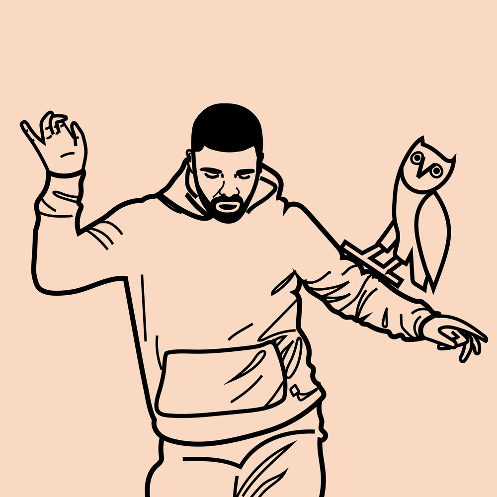
Then I started seeing people I admire killing it. Folks like Anne Donahue, Sarah Brown, and Amy Wood were all producing great stuff that I wanted to read on platforms that were aesthetically pleasing, and I decided I had enough of the old taramahoney.com. Unlike the old Kanye, no one would miss it - so there was more of a chance the new one would be better. I wanted to feel like Drake in this picture of Drake and the OVO Owl dancing.
Truthfully, it’s probably not that weird that as a web designer my website design changed twice in a year. I gotta stay on top of the #trends and my experience in the field building and looking at websites all the time will make my taste and preferences change perhaps a little faster than someone who doesn’t do what I do. But it does point to an important problem I think is worth speaking to, which is that the old design didn’t reflect the kind of work I wanted to get. When I built my website a year ago, I was just trying to get something up that would profile my web development work in an original way to potential clients. When I deployed it, I was happy that it was up and proud that I had a medium to showcase myself, but I didn’t really think much more of it than that.
I realized I needed to make my website into more of a tool for onboarding more (better) clients. So when I came at the new design, I asked myself a few questions: What kind of work do I want to get? What do I want people to think of me? How do I want them to feel when they come to my website? Where do I want them to go? What do I want them to know?
When you're building yourself a platform to market you on, treat yourself like a client.
I realized I was approaching my website the way I would approach a client site, which is ultimately what this post is about. Think about it this way: you owe it to yourself to produce something you’re proud of. And, bonus: if you like it, probably a lot of other people will, too.
Think about the UX/UI and the flow. Test it with different users. Ask them how they found it to navigate - honestly. Send it to your design-savvy friends and ask them, “if you were looking for a new web designer and you came to my site, would you be like ‘yas HER this is the one’ or would you be like ‘naw’”.
Start small, go slow, and do more than one version
I mocked up my idea for the initial layout and did a little color and logo brainstorming like I would have with a client website. This might sound like not a big deal to you, but putting that much work into my own thing that I wasn’t getting paid to do was huge for me due to my inherent laziness and propensity for doing nothing.
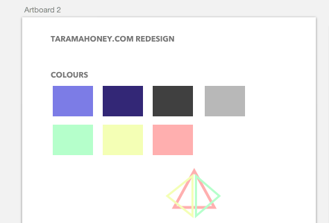
This tiny little bit of brainstorming saved me some time when I was mocking up the prelimenary layouts for the site, which looked like this:
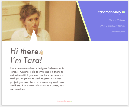
I spent about a full day designing and developing the new layout and styling and then showed it to a few people asking them for honest advice. I framed it in the context of “for my career”, so they felt that they could say things like, “I don’t like this” and, “this doesn’t make sense”. One of the things that really wasn’t working, people like Taylor Scollon noted, was that awkward polygon I was using as the navigation. I drew it this way initially because I was tired of horizontal navigation bars and wanted to do something original. In my effort to do so, I moved away from both good design and good UX design. My navigation blended into the header div and wasn’t visible to the user, and it just kind of looked bad.
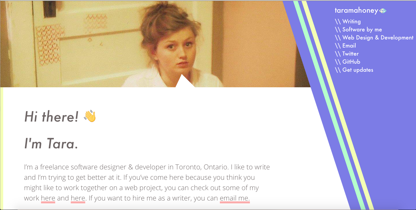
The next day, after I’d slept on the design and the feedback, Taylor suggested I make the navigation take up the entire height of the window. I liked this much better from a design perspective, and it was more visible to the user. It also gave me the opportunity to add the two slanted lines on the desktop version to match my slashes in the navigation and added another opportunity for my logo to blend in with the pallette colours I’d chosen.
Make it individually yours - it should show your personality
You are not like anyone else - so why should your website be? There are thousands of people using free themes out there, but if you have the power to make yours original, you should go for it. It stands out to potential clients/employers.
*Obviously* showcase what you can do
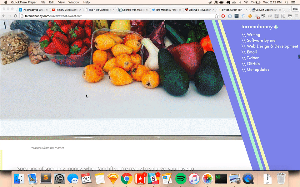
I have changed a lot this year, which is largely why the site redesign was so needed. Part of that change happened to include a desire to move into work I found more fulfilling, like writing. So I decided to add this to my list of things I could do on my website. I changed the “blog” section to a “writing” section and made different categories for topics I’ve written on.
I added this transition to my writing page to show that hey! I can do simple JavaScript transitions that look fancy and to showcase my writing in a visually pleasing way. So this section was a double whammy - it shows that I can do writing and coding.
So what?
All this is to say: if you think you need to either a) redesign your website or b) get yourself a website to accurately and beautifully display what you’re capable of, you probably do. And when you get to it, give it the time it (and you) deserves. Your website should be something you are excited and happy to share with the world.
Especially if you’re a freelancer, though this can apply to anyone/thing with an online entity, your website is one of the only portals through which people get to know you. It is your resume for potential clients to scan and determine whether or not you’re up to the job and it is important that it grabs their attention, thrills them, and makes them think, “this is the one”. Personal websites: de facto love letters to future employers/clients.
We’ll see how I feel about this version in 8 months, but I have a crazy theory that spending the time I did on it will make it last a little longer out in the world. So go on - take the plunge! Future you will thank you for all the ca$h money - or at least the compliments.
Thanks for reading! I’d love to know - did you find this helpful? Did you find it annoying? Did you get to the end and ask yourself, “wtf did I read this”? Please let me know. I’m always trying to improve my writing.
If you liked it, I can send you an email with my new writing every week or so.